Diabetes is a terrible disease, and predicting its onset in advance would be extremely valuable. This is the goal of the Pima Indians Diabetes Database.
A population at high risk, the Pima Indians, was monitored and a variety of medical data recorded for 768 women, including blood glucose levels, insulin, the body mass index, and others. This is available on Kaggle as the Pima Indians Diabetes Database, originally from this publication. Let’s have a look:
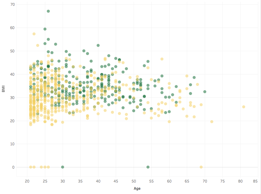
This is the body mass index (BMI) as a function of age. The BMI is the ratio of weight to height squared. Some people have a BMI of 0: the weight was not measured and the missing record was encoded as a 0. This is common in other variables too: in the Pima Indians Diabetes Database zeroes represent missing values, except for the variable Pregnancies. From now on I will not display such values.
In this plot a green point represents a person who was later found to have diabetes, and a yellow point is a person later found healthy.
We see that BMI and age don’t correlate much and that green dots occur in higher proportion at higher BMIs (for heavier people). Obesity is a risk factor for diabetes, though the connection doesn’t seem by any means one-to-one, at least in this plot.
What about other variables, such as insulin and blood glucose, as measured two hours after the administration of a carbohydrate solution?
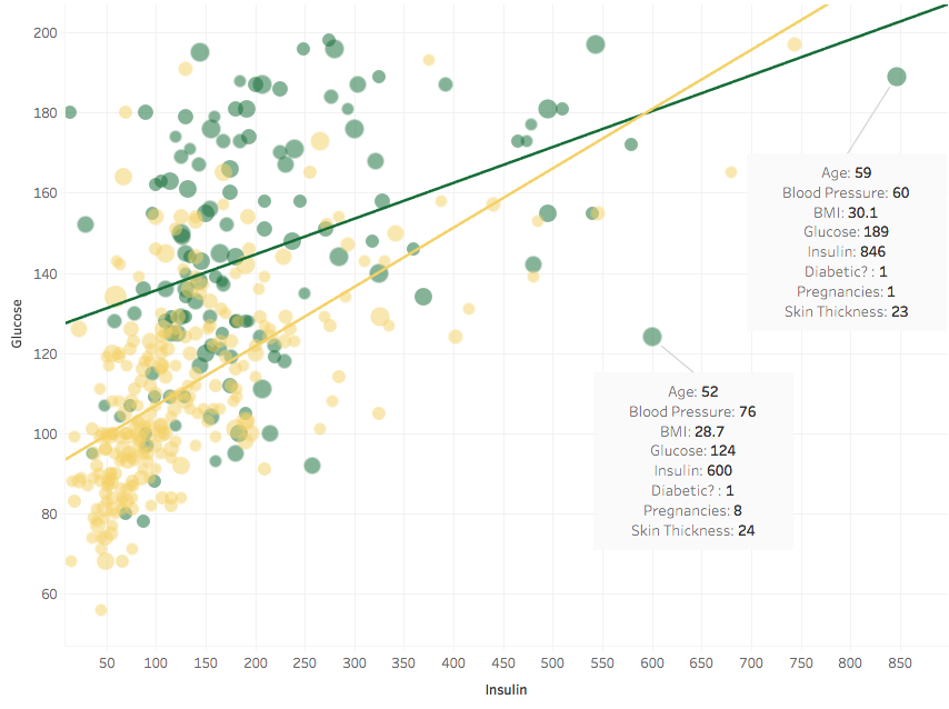
This is a standard test run by the scientists who compiled the Pima Indians Diabetes Database, and blood glucose above 200 would mean that the subject is already diabetic, by definition, at the time of the test. So clearly we have no data-points with a Glucose variable over 200. It seems also that people with higher Glucose and Insulin are more prone to becoming diabetic later on. I added trend lines for the two groups (diabetics and non-diabetics), showing that the two variables correlate. This is something to take into account in case we want to perform a regression later on.
The size of the points represents the age of the person, but I don’t see a strong pattern, so this is not particularly useful. It seldom pays to try to cram too much information in a single plot.
The trend between Glucose and Insulin seems affected by two outliers. They have a strong leverage and pull the green line down. I marked them and displayed the values of the other variables. What happens if we remove them?
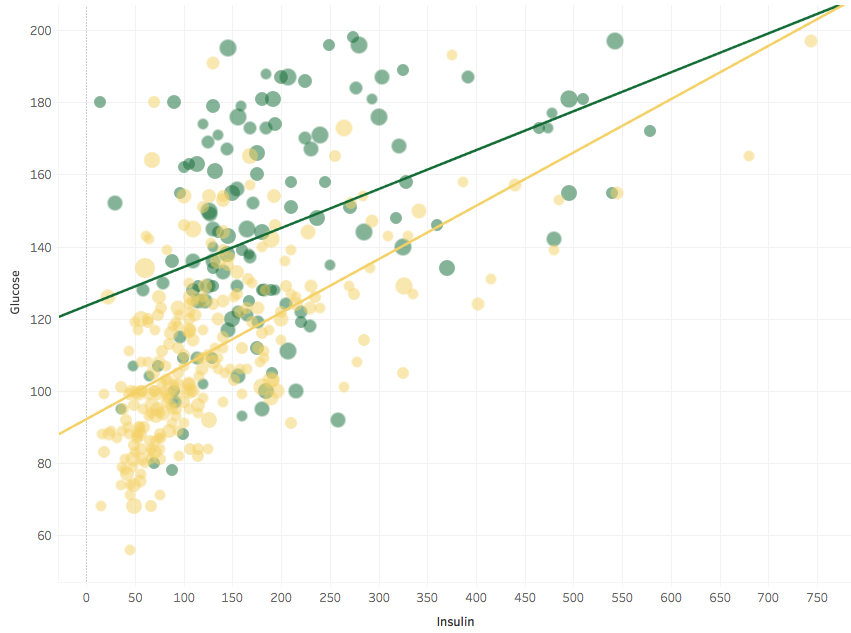
Up goes the green trend line, and R-square improves. The main conclusion still holds: Glucose and Insulin are correlated. Here is a log-log plot:
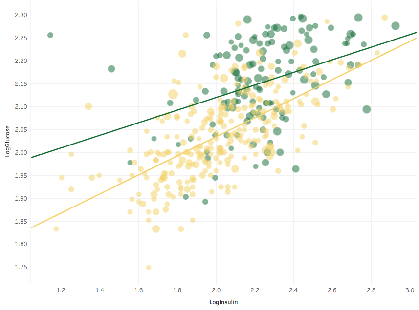 The large number of overlapping yellow points in the previous plot has now more room, and we clearly see a trend with age: bigger symbols (i.e. older people) tend to cluster to the upper right, while most of the people with low Glucose and low Insulin are young.
The researchers also computed a so-called Diabetes Pedigree Function (DPF), summarising the occurrence of diabetes in the family history of a subject. Here I plot it together with Glucose and Age (as the size of the points):
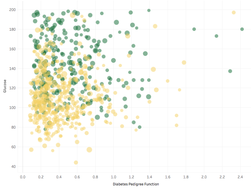
Again, taking the logarithm of the DPF allows us to have a better look at what is going on, since there are many DPFs clustered together at low values and comparatively few at high values.
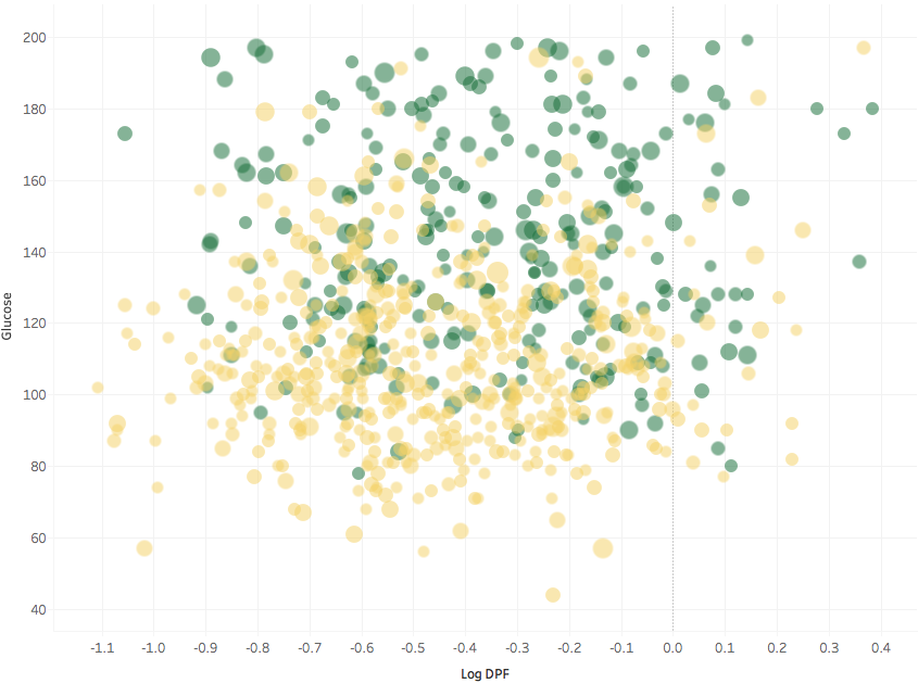
There seems to be a threshold in DPF, at about log(DPF) = -0.9 where virtually no one is diabetic. Hard to see this without the log scale. It seems reasonable that having few to no diabetic relatives is a predictor of not getting diabetes later in life, but it would be better to test the significance of this feature beyond mere visualisation before drawing conclusions.
The women in the Pima Indians Diabetes Database had a large number of pregnancies, up to 17 in one case. To see if the number of pregnancies is a risk factor it wouldn’t be enough to plot the fraction of diabetics in groups that have a given number of pregnancies: the number of pregnancies obviously correlates with age, that is in itself a risk factor. So I control for age by plotting in age bins:
There seems to be an effect, though it’s not apparent in every age group.
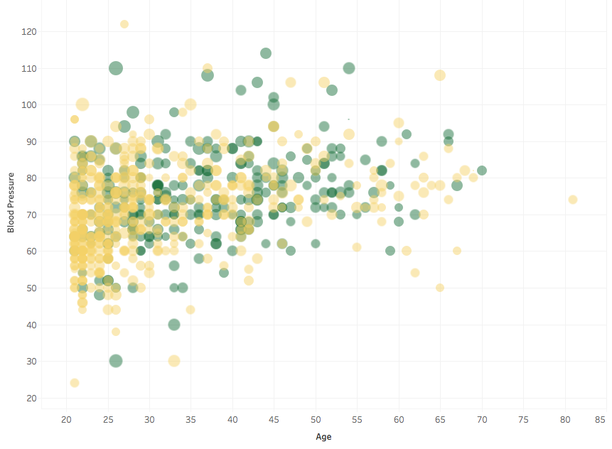
Two more variables were measured: blood pressure, and skin thickness. I was expecting the former to correlate with Age and BMI (size of the points):
but it doesn’t seem to have a strong correlation. Some people also have a remarkably low blood pressure, which would warrant further inspection.
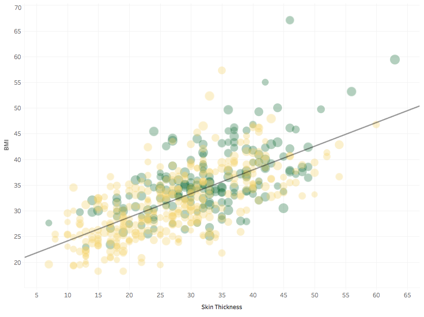
Finally, skin thickness: I show it together with BMI, with which it correlates quite strongly.
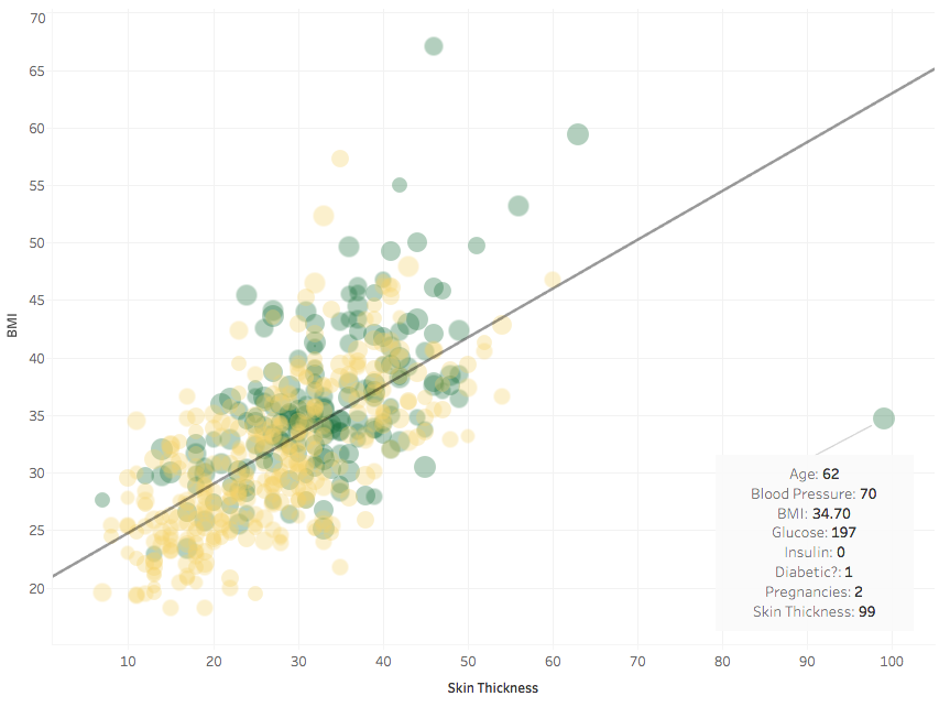 Well, except for this outlier, who had a very thick skin indeed! As usual, let’s remove it.
The R-square for the trend line is 0.45, so BMI and skin thickness are quite correlated.
So much for the preliminary data analysis of the Pima Indians Diabetes Database.
Concerning prediction, in this kernel I compare trees (from the C5.0 library in R) to svm (from e1071), measuring their prediction performance by means of a ROC curve.

